Vlad Yasinski
Case: onboarding redesign for a subscription AI photo app
Status: design exploration. No conversion results are measured yet (see the last section).
Problem
A subscription AI photo app had an onboarding of five screens: a splash, photos and video, prompt to video, a ready set, and reviews. The screens sold the product before sign-up but did not use the person’s own choices, and the next step was a paywall. The question: which onboarding mechanism makes people more ready to start a trial?
The app name is not published here on purpose.
Skills applied
onboarding-web2app-funnelfor the concept set and the brief to the design tool.paywall-auditfor the handoff screen into the paywall (see the second case).- Motion principles from public design-engineering skills were used on the final concept (see the paywall case for credits).
Method
- Mapped the existing flow and wrote down the job of each screen. The existing flow was kept on the board as the baseline.
- Chose one strategic question: should the person see value, invest effort, or see themselves in a result before the paywall?
- Wrote five concepts, each with a different mechanism and a one-sentence hypothesis, then built each as an interactive prototype on a design board:
- A, quiz and personalisation: two questions (goal and styles), a “building your plan” wait with a review on screen, then a personal plan that leads to the paywall.
- B, interactive demo: every screen demonstrates the product itself. The person drives the demo, and the final screen repeats their choice and states plainly that a plan comes next.
- C, stories and reviews: the shortest route to the paywall, full-screen stories that look like the ad the person came from.
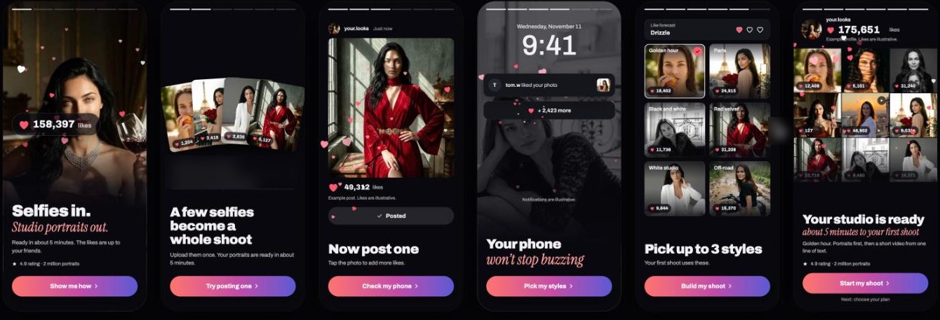
- D, profile and likes: the onboarding looks like the person’s future profile, which they assemble, with reactions arriving on the photos.
- E, avalanche of likes: reactions are the hero, photos are the excuse. The person taps a post action and a stream of reactions builds up.
- Iterated each concept through a second pass (v2) that made the person do something (pick styles, drive the demo, assemble the profile, press post). Concept E got a third pass that reused the mechanics from the paywall work (hearts flying out of a growing counter, a light rain of hearts in the background).
Previews
Six screens of one concept, where a likes counter and a slow rain of hearts carry the story from selfies to a finished shoot. Placeholder notes from the board are blurred.
What was produced
- 1 baseline plus 5 concepts, 11 interactive prototypes in total across v1 to v3 (A to E v1, A to E v2, and E v3).
- A hypothesis per concept, a screen list with the job of each screen, and the point where each concept hands off to the paywall.
- Placeholders for social proof were marked as needing real figures before any release.
Why these five
They test different mechanisms, not different colours: effort (A), proof by demonstration (B), ad continuity (C), identity (D), social reaction (E). If two concepts share a mechanism (D and E share social reaction) they run as a pair after the first round.
What is not known
- No concept has been tested with real traffic yet.
- There are no measured conversion, trial start, retention or refund figures in the source material.
- The ratings and counts on the prototypes are illustrative placeholders, not claims about a real product.
Next step (test plan)
Split the same paid traffic across A, B and C first. Primary metric: trial starts per ad click. Guardrails: refund rate, D1 and D7 retention. Stop rule written before launch.
Results (to be filled in by the author)
| Item | Value |
|---|---|
| Test dates | |
| Traffic and sample size per concept | |
| Primary metric per concept | |
| Guardrail metrics | |
| Decision | |
| What was learned |