Vlad Yasinski
Case: paywall redesign V1 to V6 for a subscription AI photo app
Status: design exploration. No conversion results are measured yet (see the last section).
Problem
The paywall of a subscription AI photo app needed a rebuild that could be tested: a clearer offer, better trust signals, honest price display, and an interaction layer that supports the offer without slowing the screen. The app name is not published here on purpose.
Skills applied
paywall-auditin this repo, which is adapted frompaywallsin coreyhaines31/marketingskills (MIT) andpaywall-optimizationin appeeky/aso-skills (MIT).- Web funnel price tactics for the offer layer: a first-month offer with a reserve timer, a per-day price anchor, and an order summary in the checkout sheet.
- Motion guidance from
emil-design-eng(emilkowalski/skills, MIT) andfixing-motion-performance(ibelick/ui-skills, MIT). These two were used as reference, they are not part of this repository.
Method
- V1: rebuilt the original paywall as it was, with real buttons. This gives a baseline that matches the control.
- V2: polish with no change of offer or copy. 4 and 8 px grid, small-text contrast of at least 4.5 to 1, a 44 px close target, aligned prices, one-line discount badge, Terms, Privacy and Restore on the first screen.
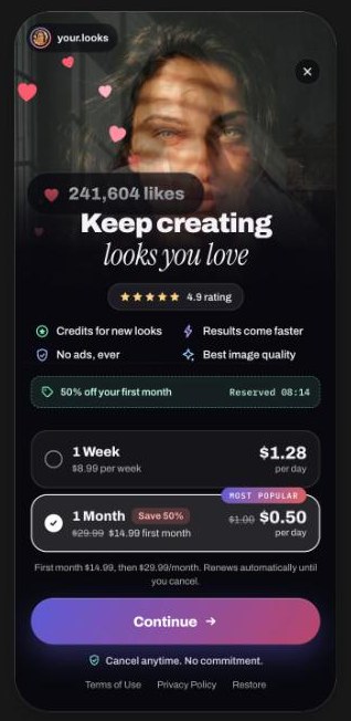
- V3: V2 plus the audit. Outcome-led headline, social proof above the plans, full price and auto-renew terms next to the selection, a CTA with the action and the price, “Cancel anytime” under the button. Offer layer added (first-month discount strip with a reserve timer, a per-day price anchor, an order summary with a “you save” line, a secure checkout cue). Motion: 300 ms staggered entrance, press scale 0.97, 400 ms sheet, transform and opacity only, reduced motion respected. Price per day became the large number on the right, with the subscription price on a second line.
- V3.2: V3 with the original prices. Collage without tilt and with slow drift, a gradient CTA with a slow light sweep on a 7 second cycle and a small arrow motion, all disabled for reduced motion.
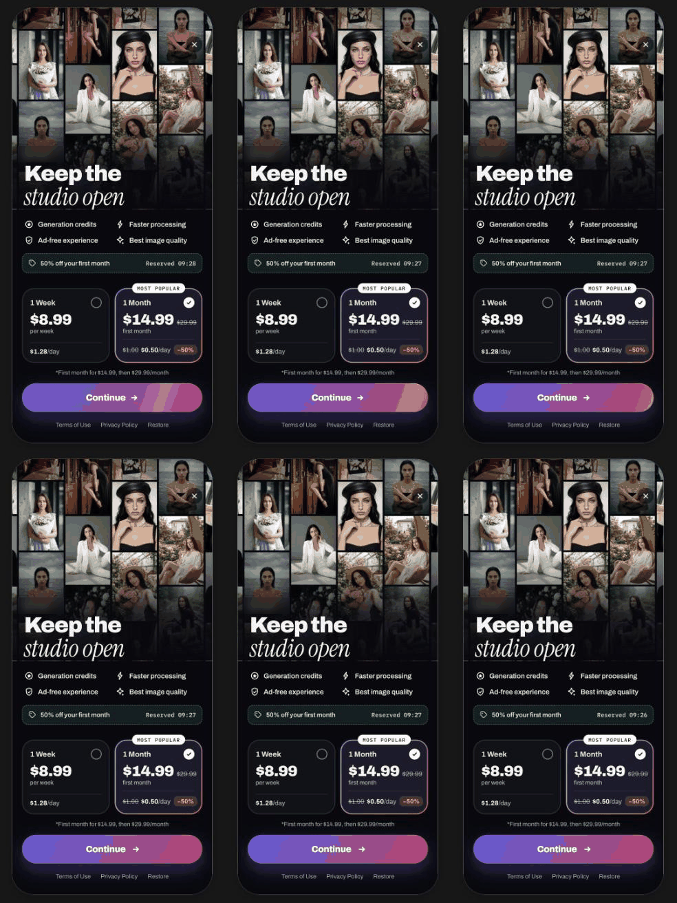
- V4: a new layout from V1. Live collage across the top, plans as side-by-side tiles, a 2 by 2 benefits grid, a gradient CTA with a darker end tone chosen so white text keeps its contrast. Same offer and prices as V1.
- Hero variants: for V3, V3.2 and V4, three examples each of the top photo block (single photo with slow zoom, fan of cards, story progress bars, scrolling feed, tilted 3D wall, carousel, mosaic, feed grid with likes, profile grid). Only the top block changes, the offer and the rest of the screen stay the same. The interface in these variants is generic: no logos, names or brand icons, illustrative like counts.
- V5: V3 with a new plan set taken from the brief. Illustrative prices: a 1-day trial at 0.99 then 9.99 per week, a 1-week trial at 4.99 then 19.99 per month, one year at 49.99. Per-day prices shown: 0.99, 0.71 (4.99 divided by 7) and 0.14 (49.99 divided by 365). The “Save 79%” label on the year is computed against twelve payments of 19.99 (239.88). The discount strip and timer were removed because these plans carry no discount, and a timer without a real offer would be misleading. Default selection: the 1-week trial, changeable in the design tool’s tweak panel.
- V6: V5 with one difference, a white CTA with dark text.
Previews
The app brand is blurred.
What was produced
- A baseline (V1), a polish-only version (V2), two audited versions (V3, V3.2), a new layout (V4), two trial-plan versions (V5, V6).
- 16 further hero-block variants for V3, V3.2 and V4 (as listed in the design board).
- Notes on why each version differs, so a test can be built from any pair.
Reasoning worth keeping
- V2 isolates polish from offer changes, so a later test can tell which part moved the number.
- V5 removes the timer when the offer has no discount. Urgency devices need a real rule behind them.
- Per-day price is shown as support next to the billing price, not instead of it.
- The CTA colour change in V6 is a test of contrast and emphasis only.
What is not known
- No measured results: no paywall view to trial start rate, no paid conversion, no refund rate, no revenue per visitor for any version.
- Social proof placeholders (rating and count) need real, substantiated figures.
- Whether the first-month offer layer helps or hurts the app’s economics has not been tested.
Next step (test plan)
Test order: default plan and trial structure (V5 versus V6 style pairs are for visuals only), then headline and proof, then offer layer, then motion. One change per test. Primary metric: paid conversion per paywall view with refunds as a guardrail.
Results (to be filled in by the author)
| Item | Value |
|---|---|
| Test dates | |
| Traffic and sample size per variant | |
| Primary metric per variant | |
| Guardrail metrics | |
| Decision | |
| What was learned |